Statement of Intent:
I have chosen to discover 'Colour' as my third project for my portfolio. Also, I would like to explore a broad and new vision for photography that will last me till the end of the year; this is great for me as capturing colour through your pictures is not only eye-catching and appealing but only gives a meaningful message behind the picture. Presenting your colours clearly is key to a successful photograph and can connect with the viewer emotionally as each colour has a different meaning to it such as purple resulting in being loyal and red suggesting pain, love, or anger. So coordinating your picture correctly is vital. Famous brands such as 'Louis Vuitton', and 'Gucci' produce their clothing to be bright clothes generally, as it shows alive and more engaged with the world and if you're wearing an expensive and well-known brand you'd want it to stand out as you've spent generally a large amount of money. I will do a couple of shoots to expand my experience in photography and give you an excellent collection of my images.
After I have a selection of shoots, I will connect to my inspiration photographers and explain how I tried to imitate them and what I did differently to make my work unique. This would prove to you I have put a lot of thought and effort into making my images the best of the best. Many photographers work in the style I inspire to be like, such as Chi Modu, Tyra Grayson, and Bun B. I will focus mostly on Cam Kirk as he's my personal favourite; I find his work professional and it catches my eye as he's on the come up right now also uses the right colours to make his work more appealing and want the viewers to look more at his work.
Initially, I thought colour would've been just taking pictures of different products which 100's of photographers have already done and I didn't really want to follow that pathway of this project. When I did more research, I found out you could focus on clothing that is trending in the music industry as every hip-hop and rapper wants to be the flashiest in the eye of their listeners which creates competition between musicians.
Midway through this project, I will develop my skill and will want to play around with Photoshop and edit my photos to a high quality. This will include rotating and enhancing the images to make them stand out and attract the viewers. Using these skills will help my photography skills and in the future when I pursue my passion for photography. It will help me go up a few grades in my GCSEs as we don't have a final exam so my coursework is what my grade is based upon; From my last two projects, I have shown huge amounts of progress and dedication to this subject as I have a real love for it. The areas I struggled with at the start was editing my images cleanly but now I can use a variety of tools (Gaussian Blur, Feather tool, Elliptical Marquee) and get the white balance and exposure, depending on the lighting and weather, to fit perfectly also to make it smooth and worth laying your eyes on.
Near the end of my project, I will write up an evaluation and give my opinion on this work. I will improve all my EBIs and turn them into Strengths without a doubt. I will make my website the best my school has ever published online. I will ensure my website is a modal website for the younger photographers who wish to be like me and wants to succeed. The great depth of knowledge they will learn from me will take photography to a new level. I will present my images digitally with a final gallery of my edits one by one as you can see the development of my progress through Photoshop.
https://thecamkirk.com/about
Moodboard:


Cam Kirk Moodboard


This is my inspiration mood board, which will help me conduct my photographs. I will mostly focus on colour coordinated clothing, which links to my chosen theme.
Analysis 1:
This image was photographed by Cam Kirk, an American photographer, and videographer. He was born in Maryland, United States on the 27th of February. He is well known in the industry and has worked with many hip hop and rap artists such as Future, Gucci Mane, Young Dolph, Lil Baby, and many more. He has gained a huge following after producing multiple iconic photos for the world. This then got him the recognition of many international brands such as Facebook, PayPal, Nike, NBA, and a lot more. Kirk went to Bishop McNamara High School during his time there he was inspired by his father's passion for photography, which caught onto him. He then graduated from High school in 2007 and started at Morehouse College in Atlanta. While located there, he pursued his true love for photography.
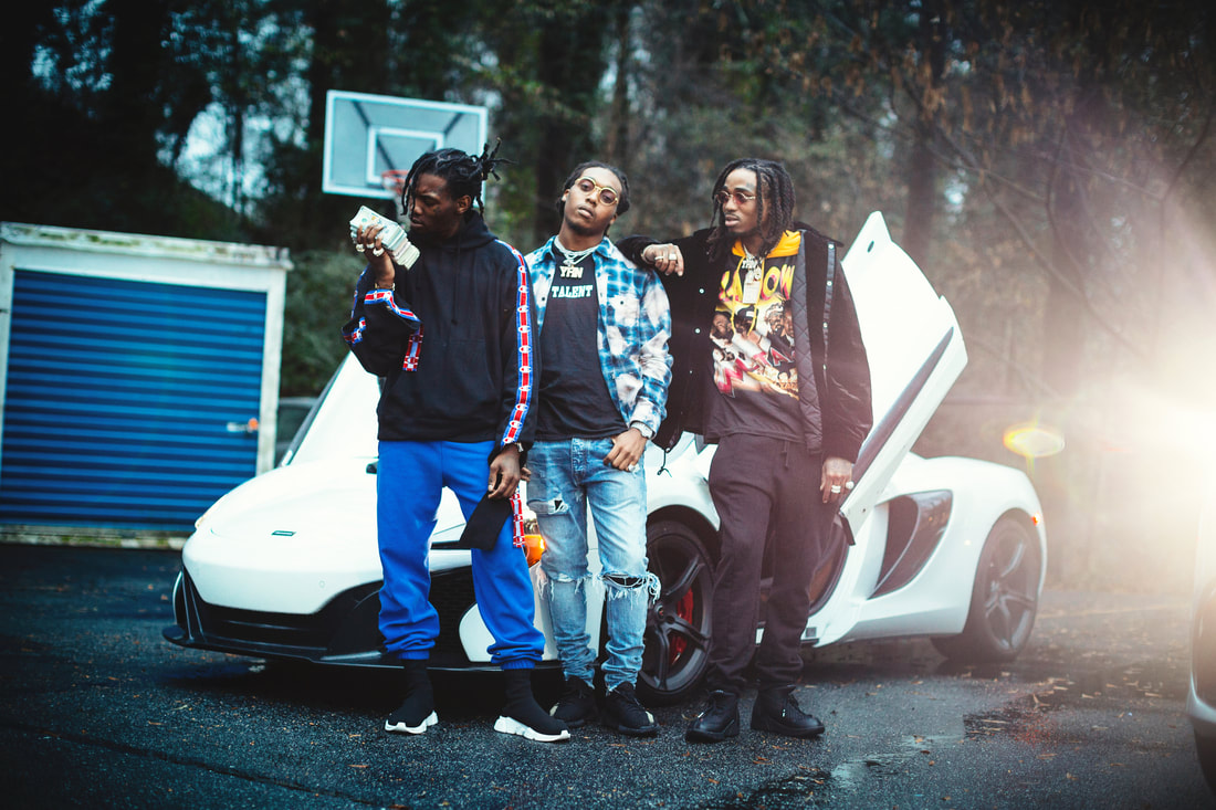
This picture is of the 'Migos' a talented trio in the music industry who are well known across the world. The image was for Rolling Stone Magazine. It was taken in 2017 amid a storm while the NFA NFC championship game, which included the Atlanta Falcons. Kirk tried to replicate the Beetle's classic photographs. This image is a portrait of the musicians. In the photograph, you can see one of them looking directly at the camera and the other two at a stack of money. This was used as a front cover picture for the main magazine brand which is read by wealthy people hence the names popularity and pricing of each magazine.
The image itself is unique and uses a variety of colours on the clothing, the car in the background, and the sunlight from the right side. Kirk most likely has used a shallow depth of field with a low f/stop to make the background look slightly blurred and the group clear. The sunlight gives a nice natural effect to the picture and adds a variety of bright hues to the picture and it is not done with a tripod that completes it nicely. The use of the white super car, with the doors up, are strong leading lines and makes the viewer put all their notice onto that area of the image, also attracts the viewer's eyes to that immediately and is in a sweet spot being in the middle between the rays of the sun and the dull forests colours. The people in the image are positioned perfectly in the middle dressed in bright clothing taking all the attention from everything else.
I like and enjoy Kirk's work because it's quite modern. Overall, I like this image very much, but I hope I can do something like this for my subject in the future, except that it looks very difficult to reconstruct. This image is related to portrait projects as it consists of capturing the face of a person and adding uniqueness to the portrait to make it more appealing to the viewer. You need to use Photoshop to edit good images and make them more impressive by manipulating them to the viewers. I will use similar colors in my work, in the sense that my pictures and this image contain more bold and bright colors so that my work will last.
thecamkirk.com/Migos
Analysis 2:

This photograph is from Tyra Grayson, who is better known as TGD (Tyra Grayson Designs) and is a 4x nominated portrait and commercial photographer based up in Birmingham, Alabama. She provides services for posters, logos, and artwork, which has got her recognition from some of the well-known artists in the rap industry like Moneybagg Yo, Lil Baby, Dababy and has partnered with BET Hip-Hop awards and also has collaborations with Quality Control Music, Route Runna Management, Whataburger and more. Her grandad got her into this field as he had a real interest in photography and fashion design. Her famous slogan 'Create Like Your Life Depends On It', signifies to do what makes you happy and do it to the best you can.
Grayson uploaded this picture on her website as a possible album cover for an upcoming American artist. This has not been named yet as a single photograph. This is a portrait image of the artist as he is staring right into the fire probably under a bridge symbolizing the pain and struggles he's been through in his life. The theme of this photo is to project to the audience he's been struggling from the start and the way also telling us how he was homeless and used fire to warm himself and now he's comfortably living and how with hope times can change for the better. This is quite a natural image as the only effect is the smoke and the rest is natural with no filters exclaiming how his life was gritty with no filters to cover anything up.
There are strong leading lines in the paper that is in the fire as it stands out as the colour is darker than the rest of the image. The lines along the wall are symmetrical, which could represent prison bars and how black Americans in the USA are racially convicted and conflict with the government based upon this. This has really been popular in this generation as they are standing up for their rights to the world rather than being brushed under the rug with the George Floyd situation causing a spark around the world which led to many riots and having the famous saying 'Black Lives Matter' well known and a deep meaning. This was shot in free form and not taken by a tripod or placed the camera in a piece of certain equipment that frames the image. They have most likely used the daylight white balance setting with an ISO of 100-400. The man is angled in the middle being the central focal point with the watch standing out and placed in a sweet spot.
I also enjoy Grayson's type of photography. I personally like these very dramatic and eye-catching images. I love the use of colors, how they come to life and how they blended together well and how using natural light can affect your images. This might also inspire me to combine portraits and landscape photographs with artificial and natural light to achieve unique and meaningful colour results.
https://www.tgdofficial.com/about
Analysis 3:

Justin Hogan is a photographer and video director living in Brooklyn, NY. Originally from Lowell, Massachusetts, Justin cut his teeth in skateboarding filming as an adolescent and produced a series of five videos under the alias “Thanks Camera”, a moniker that he still uses today. After moving to New York in 2009, Justin’s lens became more focused on sports and hip hop culture. Justin has produced both photo and video work for clients including Nike, RCA, Sony, Complex, Zoo York, 12 Oz Prophet and more. In addition to his independent work, Justin is also a co-founder of Steady Magazine, created in 2013.
https://www.behance.net/JustinHogan
For this image, the photographer would have used a large depth of field so the model can stay in focus without the background being blurry. The image was took at eye level more time took using a tripod to keep the viewers engaged as if we were in involved. The colours are bold and stand out and brings attention straight away to the audiences eye. Generally in western culture, red representing blood, pain and anger and black representing darkness or death both being sinister colours. Visually it strikes as a very dangerous combination which could also convey power and respect. They have used a fast shutter speed to capture the details on his face and give us a sense of emotion through the picture. The model has been ordered to stand in a certain position which results in a triangle pose which represents the rule of thirds and adds more emphasis to the subject being the man.
This image is stereotype of members of neighborhoods being gangsters and criminals with their hood up covering their eyes in order to stay safe and protected. Also on his hat is his neighborhood Bompton (400) which is an area within Los Angeles controlled by Blood members. The tattoos convey the pain and suffering he's been through. The photograph implies us how many families live and how hard it is to not be part of their life which consists of gang activities.
The theme of this is Power and Justice with everyone trying to get as much power as they can and use that with the lack of Justice as proof the police are racist and against a certain race on parts of the world. The theme of colour relates to my theme and if I can add a theme or backstory to my images it would be even better and what I want to archive in my images.
I aim to photograph similar to Hogan as his work is close to what I have in mind because it relays a hidden message and the reality of life that life can't filter, My results will be similar to this image in close-up or some whole body shots, but I will want to achieve a darker and more mysterious subject than what this photographer drew. You can use this image to duplicate the shadows used by the flowers to create a pattern on the model's face and inspire the results by drawing attention to my models facial features in different ways.
Plan 1:

Shoot 1:


Shoot 1-Outfit 2:


Best Image:
|
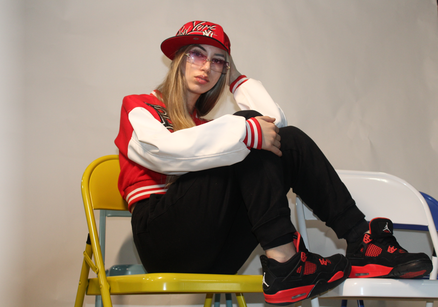
This was my best image because I colour coordinated the outfit of my model to make it eye-catching and edited the camera settings with the ISO being 200. I kept the f stop at f 20 to keep the pictures natural and easier to edit in photoshop. Also, her red shoe being in a sweet spot brings back the main theme of the colour red throughout the picture.
|
|
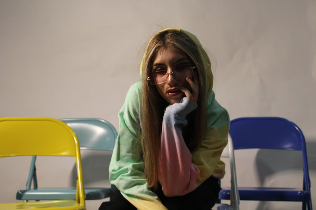
Worst Image:This is my worst image because the shadow is too dark on her facial features which cast a shadow that makes it unappealing and the most important aspect of my picture. The colours aren't really visible in the picture so you wouldn't know what's supporting what.
|
Plan 2:
Shoot 2:


For this shoot, I was allowed to bring my camera home to capture professional images with the settings be adjusted accordingly. I used my brothers to model for my shoot as it was appropriate and captured their clothing with blends nicely with my theme as similar colours were shot and brought the theme of colour to the images. Based of one of my analysis, a car was used as a background prop for the photographs to develop a sense of wealth and power so I took full control and obtaining cars to be used in my images with a touch of my own with the cars being personalised and modified. I felt proud of conducting a good shoot in my eyes with the images coming out to a high quality except a few which was my fault as I wasn't aware of the settings being wrong and the limited amount of time I had.

|
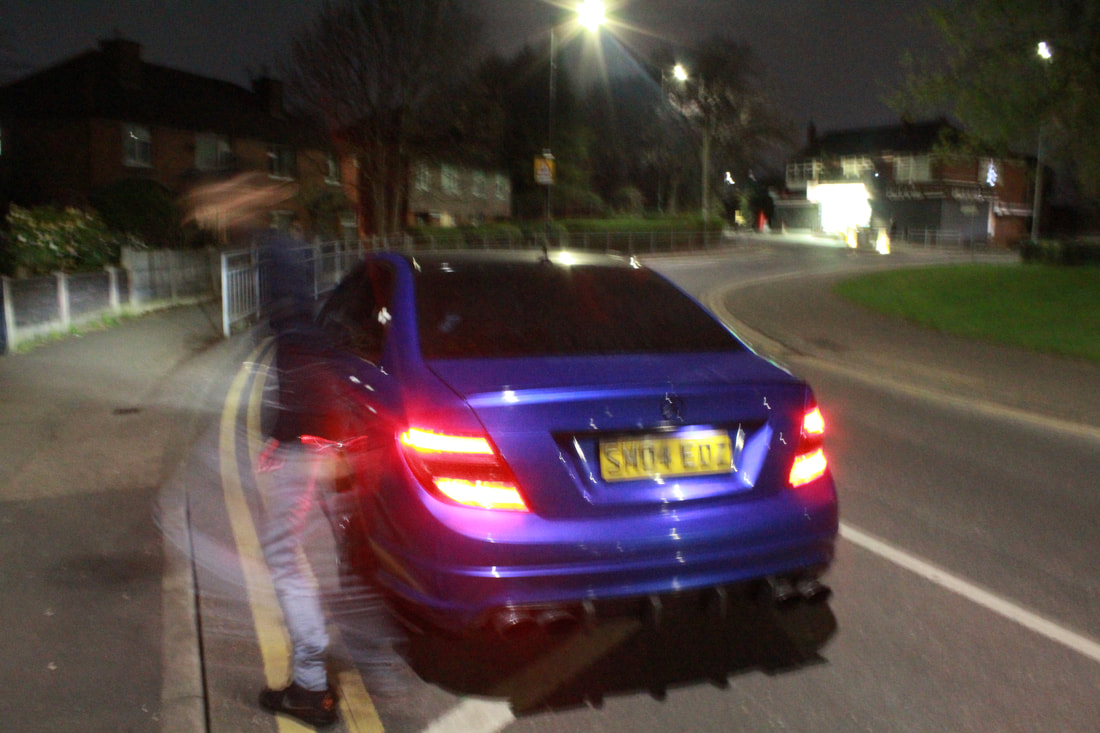
Best Image:This image I felt was the best as there are strong leading lines down the tracksuit and it matches the colour of the model's t-shirt and shoes. The subject matter is emphasised and and draws your eyes to it. It is well focused as the ISO was 200 resulting in a crisp and clear image. The choice of the background of the car was influenced by my mood board and gives a nice touch to the picture.
|
|
Worst Image:This image was not my best because its out of focus due to the wrong shutter speed and ISO. This has made the picture to be grainy and noisy. Next time, I would improve it by adjusting the shutter speed depending on the light and place I am.
|
Shoot 3:


|
Best Image:This is my best image because model is laid in a reclining position as I wanted and the colour composition is presented well with the blue in his shoes and the chairs with a couple splashes of blue on his top, all the colours compliment each other nicely. The exposure is just right as the bold colours don't ruin the image. Also the shutter speed was on point as the small details on the shoe is captured as well as the features on his face. I used an ISO of 300 as its appropriate for portrait therefore resulting in a clear and clean image.
|

|
Worst Image:This was my worst image as it is heavily exposed and casted a strong shadow through the picture causing a gloomy and eerie effect which I don't want. The ISO caused this and as it was my first picture my camera wasn't really adjusted to the lighting and environment resulting in a grainy image and more problems with the picture is the models expression and posture wasn't what he was instructed to do.
|
Edit Moodboard:
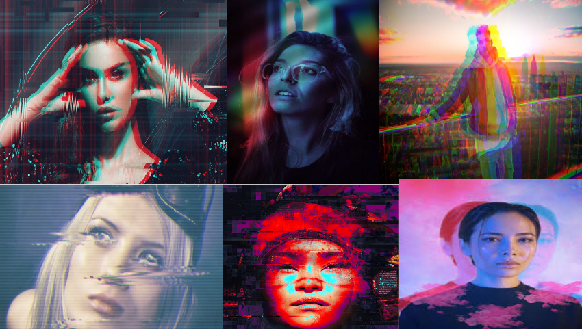
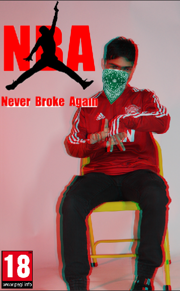
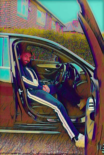
After conducting research, I soon discovered a gap in these glitch edits that I could be sure I could fill and not only does it look nice and trending it's quite unique and heeds a mysterious and unknown feeling to the viewers which aren't really popular and something I wanted to shine a light on especially involving bright and bold colours throughout the images.
Edit 1:


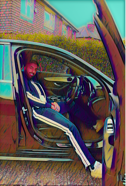
In my first edit, I made sure the picture was all smooth and cut all the sharp edges within the image. After, I switched to the raw mode to adapt to the changes and increased the colour, highlights, and shadows, and contrasted the image back. This is the finale piece that took me a lot of time and effort
Edit 2:


Edit 3:


Edit 4:


Edit 5:


Final Gallery:


Evaluation:
I chose this particular theme because I haven't really found photographers that capture true clothing until I did a bit of research and discovered some new ones such as Cam Kirk and Chi Modu. I went down this path rather than capturing colors within objects as it's fun and easy to do with complex designs. I enjoyed this theme a lot, probably my favourite one as I could take control and display my vision through images. It also has developed me to be more independent and precise with my shoots and settings. There's not much in Photoshop I could do so I had to excel and take advantage of my edits.
In photography, I liked working with my work and editing the pictures I took, so using Photoshop was the most interesting for me. I enjoyed editing images in Photoshop, but I also took interest in taking pictures because it's attractive to see visually and artistically. There were very lots of very nice composition skills to take pictures in my shoots. I also improved myself by capturing colours more professionally and making them look unique and creative. I also liked taking pictures of the models. The background looks very nice and the image looks more professional and high tone. Some of the images were captured in a sunny environment, so I learned a lot from them. So I learned how to change the lighting settings of a manual camera to adjust the ISO to make my pictures crisp.
I learned a few edits from the tutorials I watched as I can duplicate layers and add a background and merge them together. I had to adjust the properties of the images like the saturation and brightness. They were all beneficial as I scrolled down, I have seen a variety of different versions of the edit I was trying to replicate. When you take a picture, you want everything to be very accurate and crisp, so F/stop is useful for getting clean, crisp images. As for lighting, I usually prefer to set the camera to ISO automatically because I don't know what kind of lighting I'm using. Therefore, let the camera decide to be more specific. If auto doesn't work, adjust the ISO. This is easy to use because I have been using the camera for a long time.
Photoshop is useful because it's easy to use and reliable, even if you have to work from home. If Photoshop’s not available, you can Photopea the best tools are color adjustments/filters. This is because it has a higher range of vividness I like to enhance the colours to make the colours more vibrant. As a result, I enjoy it because it is can generate images of excellent quality.
My most successful part was coming in my free time and conducting a photo shoot with Justin. It was very professional, the pictures I took with him were great, of great quality and my website looked more professional than that. Also, it was a very good experience because I learned how to direct the model, I am using and learned how to direct it the next time I take a picture.
Due to the pandemic, I was limited on the shoot locations I could do and the time we had as school was closed for a long period; which resulted in me to be working at home making me more in charge of my work as I had to take pictures at home and edit my website as well. I handled the situation very well as you can see.
